In my first blog post Cognitive User Experience Design - Where Psychology meets UX Design I gave an overview about combining Psychology and Design. As mentioned in my second one, Cognitive UXD: Motivation, the topic Motivation is very comprehensive and has a valuable impact on design. Therefore, I take you on a short tour and describe the role of flow in design. In short, knowing the Flow Theory can help that the user comes or maintains in the flow zone. The aim is to “Go with the Flow!”
What is the Flow zone?
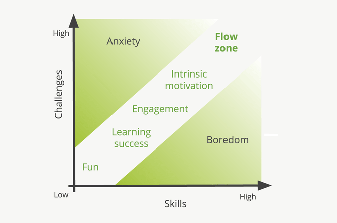
According to the psychologist Mihaly Csíkszentmihályi an excessive challenge leads to feelings of overload, frustration and anxiety. Contrary, excessive skills can cause feelings of underload, routine and boredom. Matching challenges to skills is therefore considered a key factor for flow.

The state when challenges and skills are in the right balance are known as to be “in the flow”. Within this state, the person is fully immersed in a feeling of energized focus, full involvement and enjoyment of the moment. Being within this flow zone, the person loses track of time and/ or space, performs the task for a sheer pleasure, is intrinsically motivated and much more productive and happy.
How can we ensure to bring or to remain the user in the flow zone?
First, you need to know who your clients and your users are. What are their needs, desires, expectations, approach f.i. during the purchase process. The easiest way is to ask questions.
Here is a general selection that you can ask the client:
- Who is your ‘typical’ user?
- Why does the user buy the product?
- Where will they use the product?
- What are the most important tasks the user should fulfill when buying the product?
- With which other products will yours be compared with?
- What should the user think, feel or say?
- What happens after the user bought the product?
Next, ask the user:
- Why do you want to buy the product?
- What are the most important tasks?
- What do you think, feel or say?
- What helps you with the purchase decision?
- What happens after you bought the product?
With these first questions you get a first overview of the purchase process. Of course you need to dig deeper to get a more detailed understanding. You can ask for the reasons to buy one specific product:
- What specific feature was the most attractive one for you?
- What makes this feature so attractive for you?
- How can you touch the user emotionally to make him a loyal user or that he remains a loyal user?
As you can see, a look from different perspectives is necessary. The more detailed and holistic you understand and involve your users, the better you can create experiences for them that will carry them along or make them to remain in the flow zone.
In this phase you have already achieved a lot. But don't forget to test and improve.
By measuring, you can see where the user flow is working and where it is not. Find out where a smooth process is interrupted and where the user falls out of the flow zone. Take a look at the dropouts and do a Usability Testing. Especially in Usability Testings you can directly observe the facial expression of the user and the behavior during the execution of tasks, which gives you even more information. You can see whether the user is in the flow zone, i.e. whether he is fully immersed in a feeling of energized focus, fully involved and enjoying the moment. Take the time to test. It's worth it and the key to make it right. You will receive clear indications of starting points to improve the experience.
Which recommendations can help?
As UX designers, we should ensure that users enter and stay in the flow zone to experience joy. These recommendations can help to increase flow in the design:
- Guide the users by providing information on what to do and how to do it.
- Ensure that the users understand where they are and what tasks they need to perform. Create f.i. a clear and intuitive navigation structure.
- Find out what disrupts the user’s workflow. Reduce confusion and interruptions such as notifications or bugs.
- Be close to the user’s semantic to reduce the cognitive burden. Think about how the user naturally wants to interact.
- Think about what is really needed and delete unnecessary interactions, content, etc.
- Ensure that there are no annoying, repetitive tasks or functions. This can be reduced with Usability Testings. Think about how you can make the experience smooth.
- Set clear and achievable goals such as the note to check the 4 meetings you have today in your calendar.
- Divide a big goal into several smaller ones. Let the user achieve more quick results while driving the big goal forward.
- Think about how the communication be improved to achieve the goal.
- Provide accurate and immediate feedback on actions. Visible, auditory or tactile feedback can give confidence that a process is running. If you press a calendar entry for a longer time, it gets a little bigger and you can move it to an earlier time.
- Give some rewards such as a free downloadable e-books or something similar that makes the user happy.
- Provide challenges that match the skills of the users. It is very important to have a good understanding of the users and their skills and to challenge them to stay interesting.
I hope that I could give you some interesting questions and recommendations. I wish you a lot of fun to create inspiring designs in order to bring or to remain the user in the flow zone. At the end of the day, our aim is to satisfy users.
In my next blog post I focus on Cognition and describe its role in design based on the Cognitive Load Theory.

