User experience is (also) content
Feedback from a usability test on the old website: ‘If I need to find something, I have to start by translating the officialese’. Ouch! But that was the old way. The new content was all drafted in the users’ own language – officialese is history. A clear content strategy, content guides and coaching sessions enabled 300 cantonal editors to prepare content in a format suitable for online use. The number of pages was reduced by 50%, from 24,000 to 12,000.
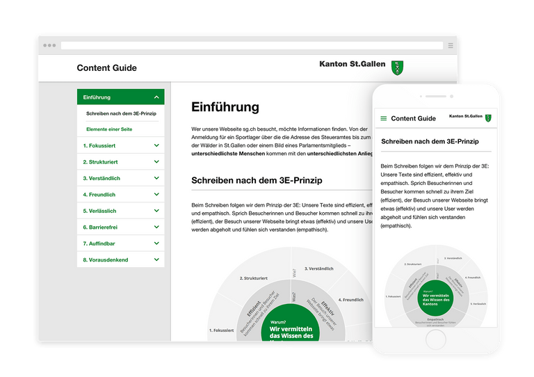
Digital content guide
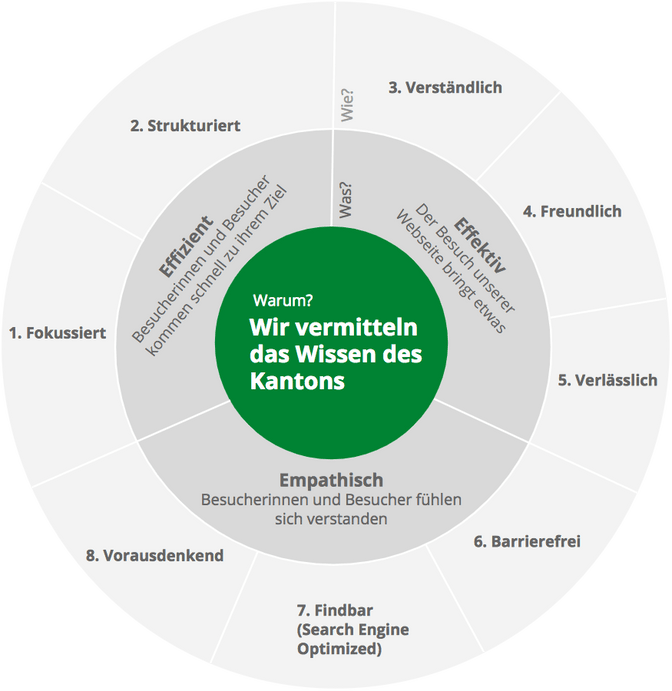
The central tool is the user-friendly digital content guide: making things as easy as possible for the editorial team is the only way to help them produce texts that are as easy as possible to read. We set great store by usability. The content guide is based on the 3E principle: our texts are efficient, effective and empathetic. In other words, visitors achieve their objective quickly (efficient), visiting our website provides users with the right information (effective), and our users are supported and feel understood (empathetic). And all of this with the previously defined goal in mind: to make the canton’s expertise accessible to all residents.

A central search function
‘Which authority is responsible for this?’ This is not a question that the inhabitants of the canton of St. Gallen will ever have to ask again. The comprehensive central search function makes everything accessible. Whether I am looking for my children’s school holiday dates, details about a vehicle inspection for our family estate car, or how to fill in a tax return, sg.ch offers a central search function and a page structure that shows information from every cantonal authority.
Structure and orientation thanks to smart features
A search function as a core element is something new to the Swiss administration. This bold step to focus on search functionality has many benefits: on the sg.ch home page and other landing pages, tiles offer quick access to the most important content. These tiles are linked to the search function and immediately respond to a query. Enter the first few letters of a search term, and the relevant tile presents the required information, which is then just a click away. Initial data shows that this way of providing information is being actively used and is popular. However, those who prefer to use the page’s navigation function still have excellent usability to call on: a full-screen overlay means that the entire content structure is visible at all times. This provides users with consistent, clear orientation.
Close collaboration as the key to success
Sg.ch took a conscious decision to choose a design and concept partner with their finger on the local pulse. The short distance between Liip’s St. Gallen office and the cantonal offices, just a five-minute walk apart, enabled close collaboration. Our implementation partner Online Consulting was also involved right from the beginning to continuously oversee the implementability of the concept and design. The high level of motivation of all those involved, particularly the 300 participants from the canton of St. Gallen, was a key factor in the project’s success. The positive feedback about the new website speaks for itself.
Fame and glory to Caroline Pieracci who supervised the project in the fields of content strategy, guidelines and coaching and developed the digital content guide. As well as to all Liipers behind sg.ch.

