The biggest problem with a company's digital innovation is that as the company grows, it increasingly loses contact with its end customers.
At the beginning of an idea, there is the founder who experiences themself the problems of their users. Then a legal and compliance department comes in and interferes in this relationship. Then a Product Manager. Then a strategic committee. Then a UX/designer.
Without realizing it, the company in question finds itself one day with a launch (or a redesign) of its digital product that is no longer convincing. With users who feel misunderstood for things that seem so obvious to them.
How does one get there?
Simply because the gap between the company and its customers has become too big in the corporate world:
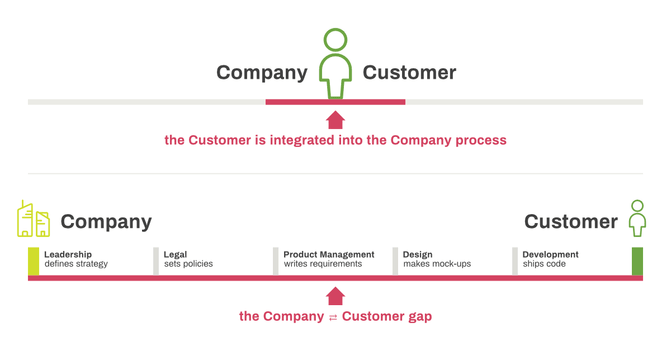
The gap between business and end user (credits for initial diagram: Luke Wroblewski)
The real problems of the end customers are interpreted and modulated to meet each of the constraints of the project stakeholders, and that's how you come up with go-lives that are a big flop. The excitement of the launch quickly turns into a nightmare when an avalanche of bad comments arrive on the AppStore.
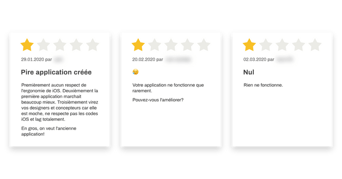
Examples of comments on an Apple AppStore mobile application
Or even worse, when the company sees zero conversion in the new mobile funnel that it has spent hours optimizing — except that no customer reaches it because there are too many steps to get there between localization pop-ups, marketing pushes, and endless forms:
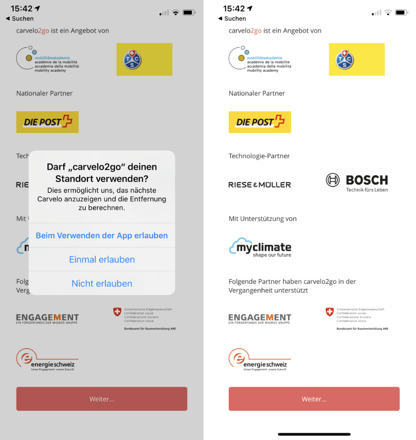
Examples of screenshots of Carvelo2go that the user sees on his very first use
The UX of this mobile application is by far not the only one to have these issues in 2020, unfortunately.
How to reduce the gap between the digital product and the customer/end-user?
"Hi Thomas, I'm calling because we have a problem with our mobile app. We've done a lot of workshops, created a lot of post-its, did iterations of agile development, but it's the big flop. The mobile app isn't working. It's almost not getting downloaded. So I was told that you offer Lean Startup or Design Thinking workshops. Do you think that's what we need?"
That's the verbatim from a client who called me recently. His team had just launched a mobile application redesign, and the results weren't what his management expected.
He continued: "I also have some analytics and results from some online surveys we did earlier in the project if that can help you get a better understanding of the problem."
I asked him a first question: "When was the last time you spoke with your customers or users?"
A little surprised that I didn't jump at the opportunity to sell him a plethora of workshops, he answered me: "Hmmm... I'd have to ask my UXer because he's the one who took care of it. But I would say it was 10 months ago, during the preliminary workshops. But why are you asking me that?"
"Because we can follow as many methods as we want, if we don't talk to real users, we'll just keep going blind! And who better to tell you what's wrong than your own users?" I replied.
OK I see... Personally, I understand the value of talking to our customers, but we need to bring a strategy based on concrete data to our management in six weeks to get a good start."
"Deal!" I replied confidently. Confidence gained through the application of our process on a dozen or so projects such as the sustainable mobility solutions company Urban Connect, or the online coaching platform "The A-Coach".
Two concrete examples of bringing the user at the center of every decision
Urban Connect and its renowned clients such as Hilti and Roche
Judith, CEO and founder of Urban Connect, came to us to find a technical and UX solution to her innovative product. Her company rents fleets of bicycles, scooters, and electric cars to large companies such as Hilti and Roche.
We organized several immersion sessions in the life of their clients (in particular Google Zürich), following them from their office where the need to book an e-bike arose, to the elevator without internet connection, and then to the basement where we had to find the said bike among a hundred or so.
We could have done as many fictitious "User journeys" on our beautiful white walls with Judith. But we wouldn't have experienced for ourselves the stress of having to get to an appointment on time. Nor the stress of knowing whether the bike's Bluetooth lock would open in the middle of a forest without 4G network.
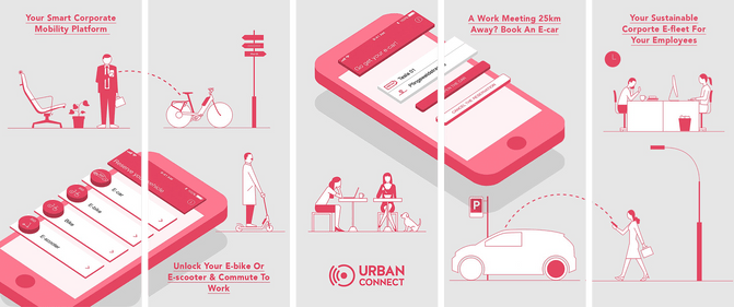
Mobile application development example by Liip: Urban Connect
This immersion in the real world gave us concrete data when we had to explain our mobile UX decisions. For example, we decided not to make an onboarding screen the first time the app is opened because users want to get to the real added value of the mobile application as quickly as possible, so they frantically click on "Skip".
Urban Connect goes even one step further in terms of user experience: they provide their own service to their own employees to experience user issues first.
Few companies can boast of such immersion...
And it's the same scenario every time we meet with a new company interested in a sustainalbe mobility fleet: prospects are won over because they have the impression that we're taking the words out of their mouths because their problems are addressed as accurately as possible.
The A-Coach
Shari, a former HR expert from the corporate world came to us with an idea. She wanted to create an online coaching platform. She was thinking big and far ahead. She already had a lot of features in mind.
Listening to her, the engineer in me was already thinking of a plethora of technical tools that we could put in place. My colleague UXer Jérémie, for his part, was already visualizing many wireframes and designs.
The project we were imagining was worth several hundred thousand CHF, with many innovative features from a technical point of view.
But knowing our professional biases, we took a step back and proposed an objective process to test Shari's business hypothesis: talk to real potential customers, and don't build anything until a contract is signed.
That's what we did.
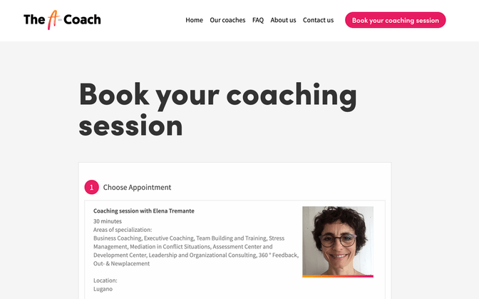
The result of our functional MVP "The A-Coach" in production, implemented in less than a week
Through about 20 interviews with typical clients, Shari adapted her business model until it triggered a "If you have a solution to this problem, I want to be the first to know!" among her prospects.
Armed with this information from the field, we built a high-fidelity clickable prototype. Then we went back to two very interested prospects, both of whom signed on before we had even built anything.
Upon delivery, these two new customers, companies with several thousand people, were won over from the first use of the platform. It sounds obvious when you say it like that, since they signed up when they saw the clickable prototype. But it's precisely this process of creating a digital application that changes the game.
Conclusion (and an exercise)
Just as when you are suddenly drawn to the series trailer on Netflix from a whole list of available choices, your company's customer needs to see the added value of your product from the very first seconds of its use.
The only way to achieve this when developing a mobile application or any other web application is to talk to your users every week, from the first day you work on your idea, and as long as your product is online. And we mean "talking for real" to your customers, not just looking at Google Analytics statistics!
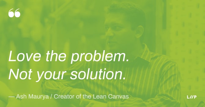
To do so, your new motto will be "Love the problem, not your solution!". Because the goal is to find problems that are worth solving. And then look for a way to make it happen. And not the other way around.
A little practical exercise for you, dear reader: make an appointment with one of your customers or users this week still, and ask them to see how they use your product, ideally in their own environment. I think you'll be surprised by what you'll learn.

