Initial Design Decisions and Project Challenges
Our design process for the product detail page was driven by the need for a fast and intuitive filtering system, as the product range from HANS KOHLER AG includes a wide variety of product types. Presenting all relevant information at a glance is crucial to help customers find the most suitable option efficiently. During the design process, we focused on the following requirements:
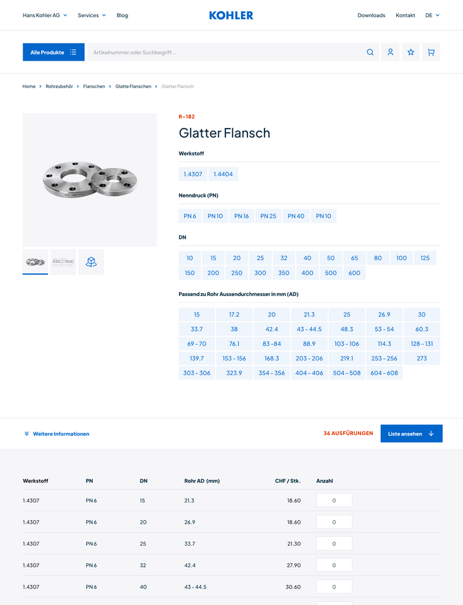
- Variant Filtering – All sizes, specifications, and materials should be accessible and quickly selectable. As shown in Figure 1, we placed these filters above the product variant list, making all attributes visible at once and allowing users to select or deselect with just one click intuitively.
- Variant List – All variants needed to be visible at a glance without sacrificing clarity. To this end, we opted for a straightforward list of all variants. Users should be able to add a variant to their order easily.
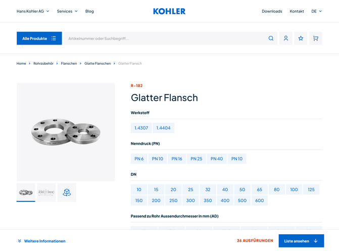
- Mobile Optimisation – Given the limited space on mobile, we focused on an alternative pattern, placing filters within select fields for efficient mobile usability.

Challenges and Surprises: User Testing Feedback
To validate the design, we turned the Figma designs into frontend code and tested it in guided user testing sessions. We quickly discovered that some of our initial ideas didn’t work as intended. The first user tests revealed surprising difficulties that we hadn’t anticipated:
- Hidden Variant List: Some testers struggled to find the variant list right away. Although they interacted with the filter, they didn’t notice that the variant list was updating. Even the animated call-to-action intended to highlight filter changes went unnoticed.
- Sticky Navigation as a Barrier: We implemented a sticky bottom navigation bar to show the count of the updated results. But it gave the users the impression that they had reached the end of the page. This unexpected insight revealed that less tech-savvy users didn’t recognise this type of element and associated it incorrectly.
These insights highlighted that we needed to rethink the placement and structure of filters to ensure a better user experience.

Solutions: Iterations and Optimisations
With insights from the testing phase, we began redesigning the product detail page with a stronger focus on intuitive and visible functions. We combined changes to the information structure and design:
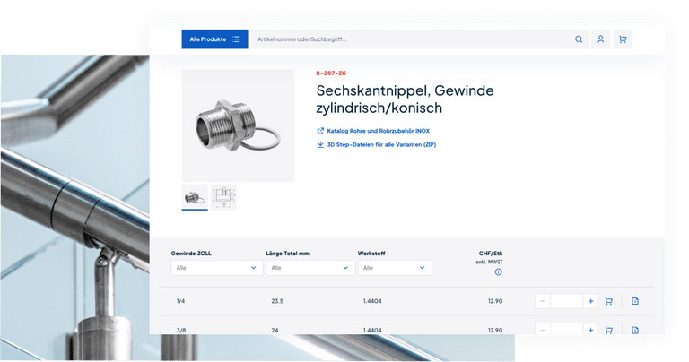
- Inline Filtering: Perhaps the most significant change was introducing inline filtering, enabling users to filter variants directly in the sticky header row of the table. This design allows users to filter directly within the variant list view because the header is always visible.
- Remove Sticky Footer: We removed the sticky footer, which helps users recognise the area below the product image more quickly and clarifies that the page continues beyond the list.
- Consistent Mobile and Desktop Experience: Rather than having two separate layouts for desktop and mobile, we unified the experience across platforms, creating a consistent, easily understandable user experience.
The Result: Efficiency for Power Users and High Accessibility
These changes resulted in a product detail page that is strong in both appearance and functionality. By making the page more accessible and meeting power users' needs, we improved ease of use. Our new solution offers more efficiency, particularly for B2B customers who frequently order large quantities and various product variants. This emphasises the value of an iterative design process. We developed a far more robust and user-friendly solution by continuously testing our assumptions with real users than the initial concept.
For future projects, we’ll carry forward the lesson that small details – like the placement of navigation elements or the type of animation – can make a significant difference. Investing in usability tests pays off, and we look forward to continuing to develop innovative, user-centred products with this approach.
Do you want to challenge your product with user testing? Contact us!

