We (David Buchmann and Benoit Pointet) spent some time to look into the backend we have for the liip.ch website, built with the Symfony CMF. We ran user testing sessions to collect our website's editors painpoints, a community survey to collect the pain points of other CMF users, then did a lot of small tweaks both to the public bundles and in liip.ch specific code, and identified and documented improvements that needed more development work.
For a user experience designer, improving a CMS backend experience is like walking a thin and chaotic path, circled by doubt and criticism. Users and contexts? all possible. Luckily, a culture of the backend has established and evolved, which now establishes a rich base of conventions, patterns and best practices. The latest trends are represented in the concepts of the latest Typo3 and Drupal8 backends.
Working on the editor experience for the Symfony CMF has however a different dimension than the latter CMSs: The CMF is a toolbox from which one can build a custom CMS. Each bundle it is composed of potentially adds something to the backend. On the other hand, the CMF being a toolbox, it is not difficult to tweak the behaviour of any backend element to optimally fit for the requirements.
We decided to follow the approach of beginning with surface improvements. On the positive side, we found:
- The basic interaction is good, as the interface is not too cluttered and the navigation by content type leads to quickly find the content to edit.
- Using the document path in the edit URL gives an easy indication of context to the power user.
- We have ckeditor enabled, but allow to switch to the HTML source for power users.
- The interface makes it hard to do fatal mistakes like accidentally deleting a document.
After noting these positive findings, we improved and uniformized the backend:
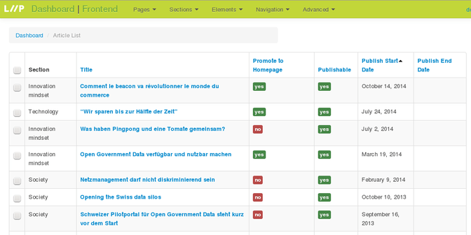
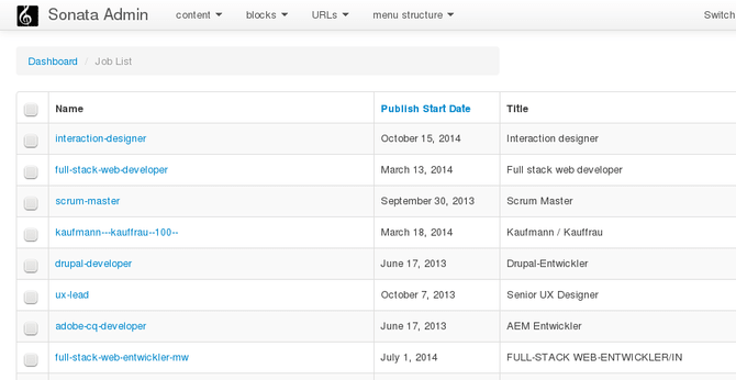
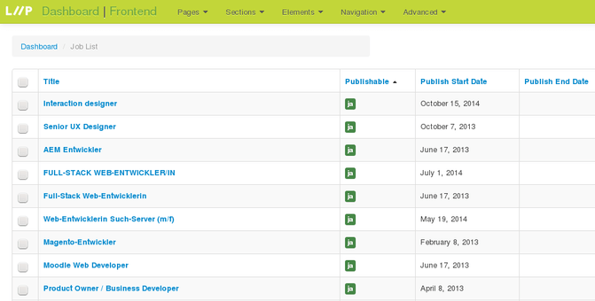
- For every admin list, we checked what columns the list should have and the ideal order of those lists. A very small and easy step, but with great impact for the user.
- Checked the admin breadcrumb and ensured a useful name is displayed for each type of content.
- Went over the groupings of the admins and made sure they semantically make sense. We moved those that are normally not used directly into an “Advanced” group. This is visible in the right column on the dashboard, and in the top menu dropdowns.
- Customized the design of the top toolbar to make the user feel more at home.
- Added a link to the dashboard and another one to the homepage to allow easier navigation.
The old backend looked like this:

After the cleanup, it looks like this:

Before further investing time into more complicated development, we sent a survey to the CMF community to tell us what they do and what their pain points are. We were positively surprised by the feedbacks we got. The appreciations often hinted at the simplicity of CMF-based backends: Only the needed features are there. This helps to avoid an overloaded user interface. The survey results report is online on the Symfony CMF website.
We then went through the list of issues from the survey and that we noted during the analysis of the liip.ch backend. We identified some more quick fixes that we handled right away. For the rest we created issues on github so that people are aware of them and might work on it. See a summary of those issues at the end of this blogpost.
Learnings
- Small efforts can have a lot of impact on the usability of the backend.
- It turned out to be very efficient to have a developer and a UX expert pair on this. We did a lot of small changes right there on the fly, had instant feedback and instant improvements with no communications overhead.
- There is some effort needed for further admin UX improvements with Sonata Admin and the Symfony CMF.
Issues identified in the UX analysis
High Priorities
- Show language of translated fields DoctrinePHPCRBundle, SonataAdminBundle, SonataDoctrinePhpcrAdminBundle
- Autogeneration of a content “system name”
- Switch between frontend and backend easily and smartly CreateBundle, SonataDoctrinePhpcrAdminBundle (this is fixed)
- Display URL for contents that are routeable, in content admin lists
- Introduce a visual distinction between routeable content (pages) and other content (page elements)
- Improve selection of parent node
- Autocomplete for path input fields
- Possibility to outline the page structure (elements, blocks, …) on frontend
Other Goodies that would be nice to have
- Introduce a content breadcrumb (in parallel with the content type breadcrumb)
- Allow editing of metadata fields from frontend
- Provide a “phpcr my admin” for power usages (there are the console phpcr-shell and the standalone phpcr-browser available)
- Cleanup SonataAdmin dashboard default template
- Support icon per content type to visually distinguish type of content in tree and within lists
- Sorting and filtering (fixed) by translated field.
- Mixed lists of content
- Keep current tab open during updating operation
- ‘Unpublish now' button next to publication end date
- Group publication information in a summatrice column
