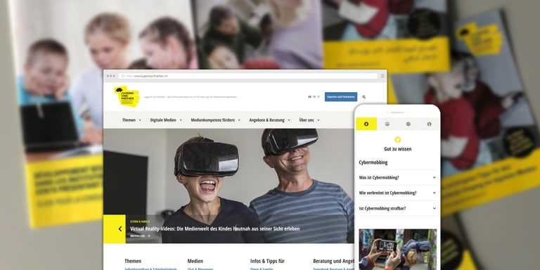
The goal
Jugend und Medien (Youth and Media) is the national platform of the Bundesamts für Sozialversicherungen (Federal Social Insurance Office) which supports media literacy. On behalf of the Federal Council, it aims to ensure that children and youngsters use digital media safely and responsibly.
I'm very happy to have contributed to such an important step, focused on redesigning and improving the whole User Experience Design:
- identify the main user needs
- simplify the information structure
- reorganize the content
- increase general consistency
- give a fresher look towards a richer experience and “brand” awareness
- improve the emotional connection
The old website
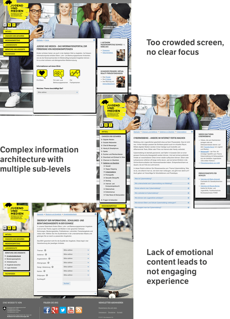
The challenge
- tight budget
- collaboration with external development agency
- many user groups and different needs
- amount of content, crosslinks and different languages
- create a digital experience coherent with the print identity
The redesign
The new website not only provides a more modern look but mostly an improved user experience
As mentioned, Jugend und Medien is a portal with specific information on how parents, teachers, staff of special needs institutions, youth workers and educators can promote media literacy in their day-to-day life. They can find tips to help the younger generation protect themselves from the risks of media usage and networks.
Homepage
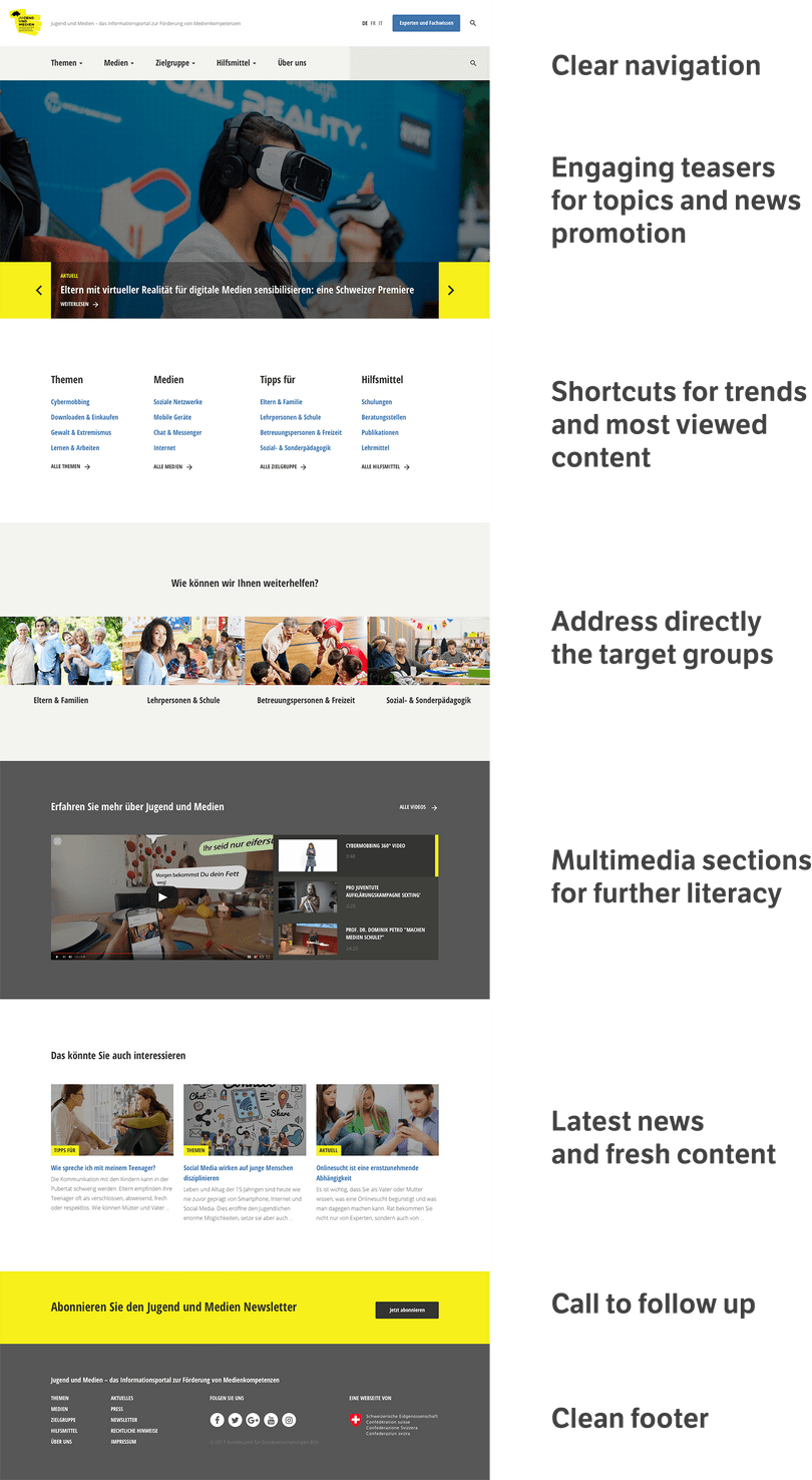
The homepage sections provide direct entries to the current trends and main user journeys. It combines the latest topics, the most popular (most viewed) pages, numerous offerings and related news.
The main navigation focuses on the major areas for parents and tutors, while for professional experts, there is a separate menu that leads to information on key topics and events, political initiatives, legal foundations, and cantonal strategies.
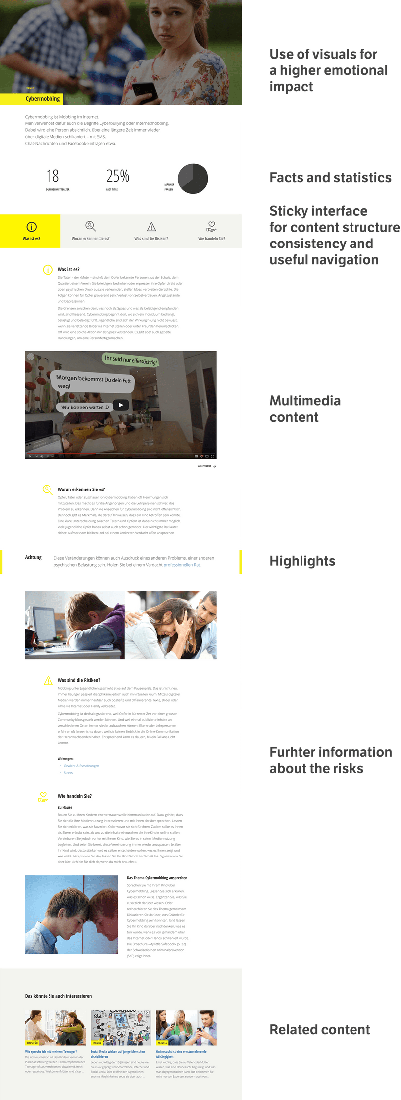
The clear information architecture and extended spectrum of content resources (texts, images, videos, pdfs, contacts, external links, facts and statistics) assists all the users finding answers for their needs.
The website is built in 7 different templates, from dynamic to static pages, from overview pages to detail pages, all follow a consistent page structure for a better usability.
The typography contrast, the yellow elements to highlight, and interactive components like accordions also improve navigation and readability. For longer pages, we developed a sticky sub-navigation which offers an easy page-content scan and a jump to a specific section.
Last but not least, the new look brought a much modern touch than before! Lighter, with more "white space", and more comfortable for reading.
Overview page
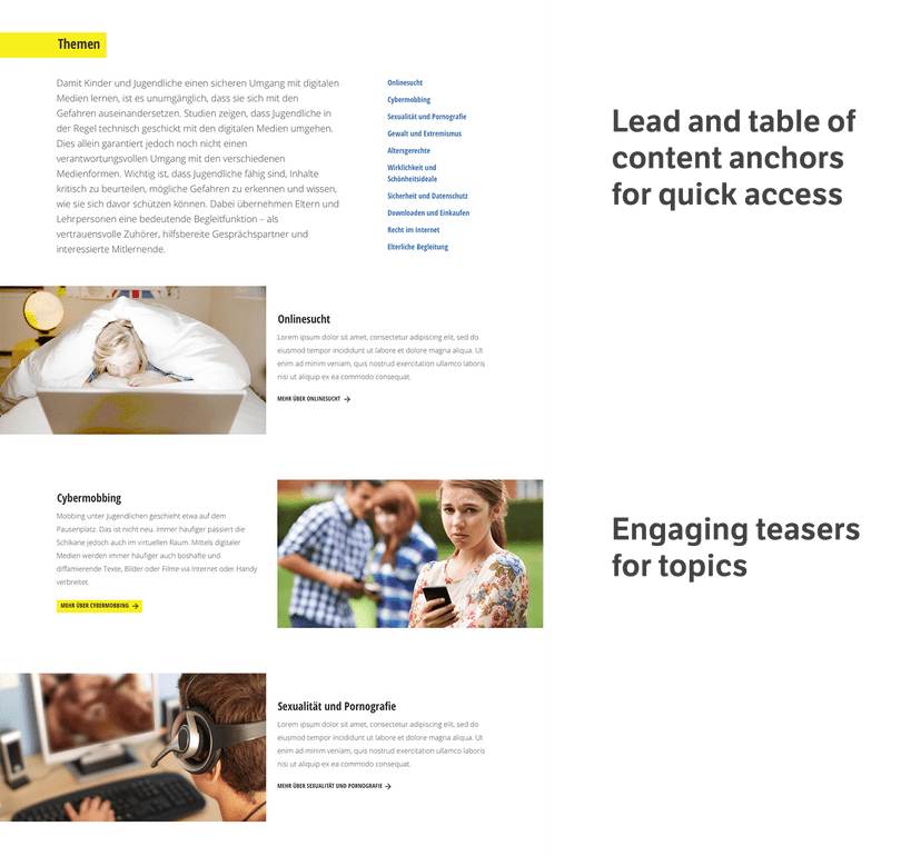
Detail page
See more on jugendundmedien.ch
The collaboration with the client
With an open mindset, we decided to start from scratch and avoid being influenced by the existing website. In a workshop with the BSV team and the support of Andreas Amsler (ex-Liiper), we listed all the user needs and grouped the data in different ways, striving for an improved concept – simpler and more intuitive –, appropriated for an information portal aimed to address parents and guardians.
Fabian Ryf, our Digital Analytics & Performance Consultant, validated the conceived information architecture from a SEO point of view. That way we ensured that content can be easily found and understood, also through search engines.
After the core structure was defined, we matched the existing content to it, splitting, merging, cleaning and even re-writing a lot of it. By refining the whole architecture we achieved a more usable and structured journey, now also with clearer content. It was just about time to adapt the interface too.
The whole concept was vivid in my head since the beggining. As we didn't have much time for sketches and wireframes, I quickly redesigned the new page templates and styleguide, attempting to involve developers as soon as possible (remember, they were external to Liip, which adds extra complexity). By the end, the client was happy, and so was I! The visuals were validated, the guidelines were defined and the project could move to implementation.
In the meantime, the client, the developers and I were exchanging on a very regular basis, reorganizing the content to fit the requirements, reshaping design to support the users, documenting updates for developers, all in fast iterations.
I must say that I really enjoyed collaborating with Collete Marti and Yvonne Haldimann. We accomplished a great result with meetings in a mix of English, French, German and Portuguese!
Visiting their Bern office allowed me to get to know the people, the environment and sense the corporate identity which I had to replicate digitally.
The collaboration with the developers
In 6 years working at Liip this was my first experience partnering with an external development agency.
I can say that I’m spoiled by my daily work in cross-functional teams where close collaboration is key for greater results. At Liip, from the very first pitch to the last line of code, User Experience Designers and Developers participate in workshops and co-create, building a product together until the end.
That said, to manage expectations when collaborating with an external partner isn't an easy task at all...
UX Designers alike might share the feeling that often what we conceptualize it isn't implemented accordingly. We design something, ship it to "the other side", and get back "half" of it. It's so frustrating that we – the so-called divas – end up doing "developer-centered design" instead of "user-centered design"...
Luckily it wasn't the case! Thanks to design-eyed-frontenders I had the chance to work with, and the use of Sketch + Invision we shared guidelines and comments, finding compromises and solutions together.
I would like to thank the development team for the amazing efforts: Raphael Wälterlin, Manuel Bloch, Patrick Gutter, Sebastian Thadewald, Michael Bossart and Co.
The result
The huge work from the BSV team and super commitment from cab services ag allowed us to achieve what I'm proud to announce at www.jugendundmedien.ch

