Do you just offer development or are there other strings to your bow?
It all began with a preliminary project. The partnership between acrevis and Liip started in the early summer of 2019 with some technical implementation. It quickly became clear to all that this was a set-up that worked, both professionally and on a human level – so we soon received a request to relaunch their entire website www.acrevis.ch. The mission: not just a simple redesign, but rather a complete rebuild that would also provide scope for innovative further development in terms of both design and technology.
These high requirements did not just spur on our Development team, they also fired up the UX researchers, visual designers, content strategists and SEO & analytics experts on our UX team. They ultimately won the management team over with three design concepts, and in doing so laid the foundation for the project.

What customers want
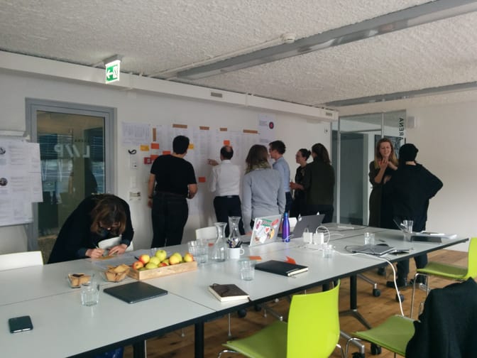
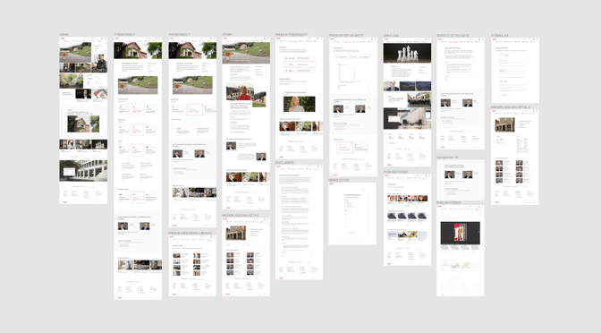
It was clear from the outset that it was the external perspective, that was important, rather than the internal one. In short: acrevis’s customers took centre stage. We used joint workshops to hone acrevis’s vision and mission. We developed and refined personas, and tracked and scrutinised the user journeys of acrevis's website customers. This was combined with stakeholder interviews to ensure that acrevis’s expectations would also be incorporated. All of this provided an initial foundation for the design and structure – from wireframes through to the information architecture.
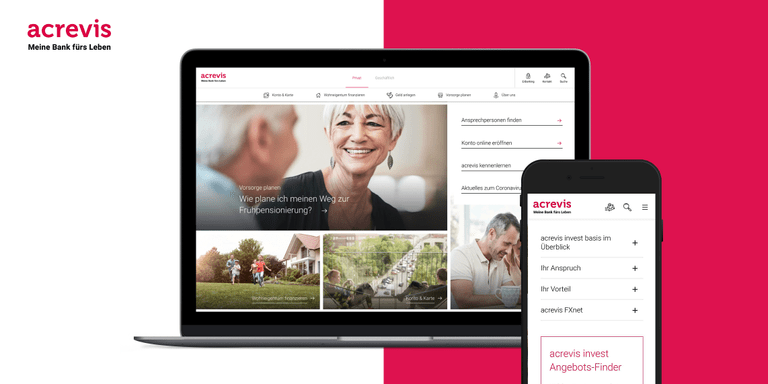
Of course, an innovative website also needs a new visual design. This was no sooner said than done, with new web-optimised typography, further development of the icon library, and fresh use of the corporate colours, moving away from severe petrol blue as a secondary colour and towards the subtle application of red as a targeted primary colour. The generous use of images and a mix of static and dynamic content bring the website to life. The website also has a clean and tidy look thanks to new element layouts and subtle micro-interactions.

Storytelling and thematic areas rather than just financial products
In terms of content, there was one key question: how do you captivate acrevis’s customers in the rather dry world of finance? Our response: with storytelling! Staying true to the slogan ‘My bank for life’, acrevis’s products and services needed more context, more emotion, and stronger links to customers’ everyday lives. This was clear to both our content strategists and the acrevis project team.
Four (or rather eight) thematic areas focussing on acrevis’s main business segments for both private and professional customers were developed: accounts and cards, financing home ownership (or a company), investing money, and retirement planning (pensions and succession). The thematic areas were presented in a colourful range of formats – from true-to-life stories to clear product overviews to personal contacts. The story protagonists were selected to closely match the personas previously developed. The final touches came from the ‘microcopy’, with our UX writers coming up with the perfect wording for buttons, forms, error messages and the cookie banner.
State-of-the-art technology for a flexible future
‘After the go-live is before the go-live’ was the technological thrust of the website relaunch. In other words, the platform needed to remain capable of development in future years, even if that would involve meeting demanding requirements. This meant that the obvious choice for a content management system was Directus, a headless CMS that keeps the back-end and front-end separate. This is based on a service-oriented architecture hosted on acrevis’s own Openshift cluster.
Now it gets technical: the headless content is linked with the page structure via a routing service developed specifically for this purpose. An Elasticsearch service offering full text indexing for content and PDFs via GraphQL ensures optimum search results. In addition, the website uses a VueJS front-end that also supports server-side rendering. The content is supplied via a Django application that offers GraphQL and REST endpoints. The images are hosted on Rokka, ensuring that the website offers high performance even with such high levels of visual content.
A nose for what is needed
Transparency, openness and regular exchange were also the building blocks of this project. Close collaboration with the acrevis project team as well as other partners ensured that any challenges were rapidly identified and could be solved quickly and easily. We even ran an internal collaboration day to enable us all to work together in a focused way as an interdepartmental, inter-site team. This meant that feedback and findings from reviews were quickly incorporated, and the website increasingly began totake shape. But what would acrevis’s customers say?

The biggest challenge was just before the go-live: usability tests. Potential customers put the new website through its paces by performing specific searches on laptops and smartphones. The whole project team was delighted to see that other than a few details, no changes were required – it seemed that we had hit the nail on the head for customers with the storytelling, a clear structure, a fresh design and high technological performance.
The new acrevis.ch website has been live since July 2020.
Thank you to the entire acrevis project team for the wonderful collaboration! To be continued...
Thank yous
We would like to take this opportunity to thank all of the (almost exclusively) local people involved in the project: JOSHMARTIN for making valuable contributions to the web page design, AMMARKT for developing the branding and image concept for acrevis, and Arcmedia for assisting with the online forms. Thank you very much!
‘Liip understood us right from the start and supported us with innovative proposals for the concept, design, content and technology.’
Mona Brühlmann, Overall project manager for the acrevis website relaunch
‘Excellent work! The stories were fantastic and implemented in a very appealing way.’
Andrea Straessle, Marketing & Communication acrevis Bank AG
‘At every turn, it was incredible to see the high quality with which the individual requirements were implemented and how stable and sustainable the ultimate solution was.’
Michael Weder, Technical project manager for the acrevis website relaunch

