This is the last and final part of the blog post series on Multi-Device Interactions. Previously, I outlined the second-screen trend in TV industry ( Part 1) and introduced some underlying models in our multi-device world ( Part 2).
In this blogpost we (finally) focus on the practicalities of Multi-Device Interaction Design. It indeed has become a challenge for User Experience Designers to develop solutions that account for the multi-device behaviour of today's user. As mentioned earlier, we have developed a canvas to think and design multi-device interactions. The Multi-Device Interaction Canvas (MDIC) is a modifiable and simple canvas to map multi-device use cases. It bases on the theoretical models we presented in previous blog posts.
At its core it respects three important factors:
- Interactions (with Devices)
- User Tasks
- Context
Activity mapping with the canvas

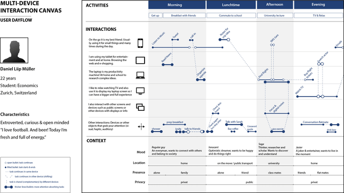
Have a look at the canvas example. As you can see, the “interaction” zone composes the core of the MDIC canvas. In it, you diagram the different interactions with the devices that can occur. Besides the regular interaction with the common gadgets such as smartphone, tablet, laptop or TV there are two other options we suggest. Throughout the day, we might encounter public screens at the train station or at school. The section “other interactions” is designated for any objects or device you interact with that also might grab your attention – be it auditory, visual or haptic. Imagine you are in your kitchen and besides your tablet with the recipe, you use a knife to prepare your ingredients. Driving to work by car could be another example (steering wheel). Practically any other activity that does not fit with a specific screen listed but still occupy your sensory channels so to say. List the user's main activity or description on top.
We provided you with an example. The legend in the left corner shows you the different interaction types (hereafter presented).
A task is either unfinished or completed. Think of reading your favorite news on your tablet for a couple of minutes. Then, you move on to a next task. In this case you would assign filled bullets to this activity, to state that it started and stopped at defined times. Oppositely, if an action starts on one device but shifts to another device or gets interrupted, you should use open bullets in-between. It is that easy.
In using dashed lines you signal a device shift or complementary usage for a same task. Maybe you listen to music on your tablet and then move to your smartphone since when leaving the house. Use the dashed lines for this. Also whenever a task is shared (complementary). For example in our scenario, TV ignites the search for a related actor on Daniel's smartphone. It is a complementary task.
If your persona engages in multi-tasking, more continuous lines appear on top of each other. The thicker a line, the more attention is directed towards this specific activity.
So far so good. What about the context? The bottom section is there for this purpose. As the user's location changes, so do his interactions with the devices. We have based ours on the social presence of other people and whether privacy (private vs. public) is given. Also, we include mood types and location specifications. Feel free to adapt the contextual dimensions.
Think Multi-Device Interaction through the Canvas
A simple watchdog is to never have more than four tasks in parallel. Keep in mind that the user's attention is much limited. There are a numerous of problems that can be spotted here. For example due to the fact that our user switches devices many times, the main activity gets disrupted. Look for disruptive factors. How long does it take a user to finish a task – basically the length of an activity path from open to filled bullet. Or what about device switches? Is there a cost of shift involved? It could be that the next device is simply not in reachable distance.
The canvas will help you to ask the right questions. What if our persona used the tablet and not the smartphone for a given task? Can this action be continued or how likely is it to occur in parallel? What happens, if the context changes and our user spends time with his friends? Is the user interested in social or investigative information engagement (two different types of processing with the content, see bog post two). Ask yourself whether complementary issues can occur e.g. how to actually search for the actor during a film? Does the user actively search for this information or does the TV channel provide him with hints or even better, companion applications.
Similar to the well-known business model canvas, it can be used in very different manners.
The empty Canvas can be downloaded here.
To give you an idea how to use the canvas, have a look at our example scenario here.
Put your ideas and scenarios to practice and “think multi-device” from day one. We hope you like our tool. Feel free to send us feedback or improvements.
