Maybe you will think of an application like Facebook, Instagram or TikTok? Or maybe an app like the SBB, Twint or something to check the weather with.
At Liip, we particularly like the ones which are really useful to our users and solve a specific issue.
The issue
When our clients from the Lausanne-Echallens-Bercher railway line (LEB) contacted us, their problem was: the real-time timetable they were offering to their users was incomplete, because old trains cannot share their position. Without this essential information, the LEB Company could not provide its passengers accurate information, in case of delays for example.
The need was a simple and effective solution, until these trains will get replaced in a few years.
After the analysis of the situation, we agreed on designing a mobile application for the drivers in the cabin. It enables them to retrieve the GPS location of the train and push it every 30 seconds to the server to calculate the real-time timetable. Easy, right?
Unfortunately not at all. In fact, at certain points along the route covered by these old trains, there are tunnels, so the calculation of the exact position is not guaranteed. Therefore, it was necessary for the driver to be able to manually indicate the position of the train to the application.
That said, when a driver is working (whether he is driving a LEB train, a bus or a car), they have more important tasks to do than checking the position of the train: Concentration on speed, turns, passengers, schedules, etc.
Therefore, the application to be developed had to solve the problem of the position, without interfering with the drivers' work or distracting them.
Field trip
To solve this problem, we went on site, and thanks to the project manager, we were able to take a seat in one of the LEB trains. We made the trip in the cabin to understand their work environment. This is what we identified :
- the device should be a tablet to have a big enough display;
- the luminosity of the device would have to be low not to dazzle;
- the colours of the interface should be contrasted for good readability;
- an anti-reflection screen would be necessary, because at the end of the day, when the sun hits the train window, the screen is almost not readable;
- the interface elements should be large with easily clickable areas.
The app
We came back rich with information from our field trip.
Listening to our client and its constraints, Nicolas, one of our mobile developers, started by testing the GPS locations. Once this worked well, he developed the application in just a few days. I worked on the colours and their brightness. The interface had to be very simple, that the driver didn't have to learn how it worked.
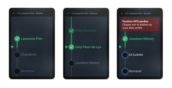
A list of stops automatically scrolls through, according to the GPS locations. If the device does not receive any more locations, at its next stop a visual and audible alert is triggered to attract the driver's attention. They only have to click on the name of the stop for the error message to disappear and for the position of the stop to be sent to the server which collects the data.

A simple but useful product
It took about 20 days of work only - from field observations to the implementation of the app on tablets - to get the application up and running. The collaboration with the project manager Pierre-Yves was excellent. In addition, Nicolas and I worked hand in hand to ensure that design and code got along and stayed within the budget. An application is not always the result of a huge and complex project costing tens of thousands of francs.
But even more than that, I believe that the greatest pride we take in our job is the satisfaction of solving a real problem of users with an application.

