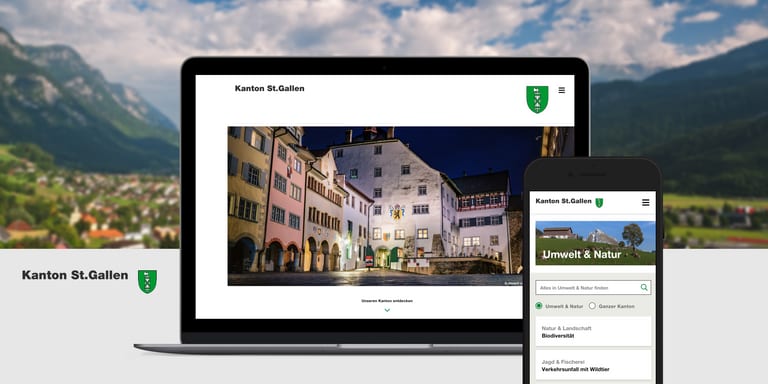
Everything in one place, more streamlined and easier to understand
The canton of St. Gallen’s new web presence has been live since the end of April. Having an attractive design suitable for all devices, providing a quick and intuitive navigation system and search function, and considering the needs of a wide variety of users were all focal points of the redesign. The new website presents around 50 of the canton’s departments and authorities. The number of pages was reduced from 24,000 to 12,000, and some of the content is already available in simpler language.
Focus on end users
The canton wanted a new, modern website, and the platform needed to be reworked in terms of both design and content. The aim was to create a user-friendly online presence with an easy-to-use, intelligent concept and a responsive design.
The search function is a now a key element, and was therefore also a part of the redesign that sg.ch particularly wanted to focus on. An all-encompassing search function, with the majority of pages and authorities available to users in one place, simplifies the content from the user’s perspective.
Flexible and close collaboration as the key to success
The concept and design were provided by Liip in St. Gallen. This proximity, with their offices just a five-minute walk apart, enabled close collaboration between the canton and the web and mobile app agency. The company Online Consulting, responsible for the technical implementation of the platform, was also present at the workshops right from the very beginning, enabling us to continually ensure that the concept and design were practicable.
The high level of motivation from all involved (in particular the 300 people from the canton of St. Gallen) made the process very enjoyable and created the feeling of one large team working together to (successfully) achieve a major goal.
Simple navigation despite a complex organisational structure
The biggest challenge was to supply users with content in a clear and efficient way across all web pages. Whether looking for school holiday dates, applying for a learner driver’s licence, or planning an extension as a homeowner, all visitors should be able to find what they need quickly and easily. Liip developed a usability approach for this purpose, using a full-screen overlay to make the entire content structure visible. This enables visitors to directly access a variety of content quickly, easily and at any time.
Content guidelines, search engine optimisation and accessibility
To ensure that all texts were appealing to readers and easy to understand, rather than being written in ‘officialese’, Liip drew up content guidelines and ran training sessions. Making the over 270 editors aware of the importance of these texts was vital for the project’s success.
Another challenge was the complexity and retrievability of the online content. The content had to be accessible to search engines. Liip drew up a set of rules for sg.ch to enable it to optimise all of its content for search machines and ensure that it was accessible. Liip used these clearly comprehensible guidelines to help the team meet this challenge.
Open over closed
The Liip principle of ‘open over closed’ sums up the project very well. All content on the new sg.ch website is accessible, and there was also a focus on open communication and having a shared objective throughout the entire course of the project.
*Being able to get an overview of the topics, information and services detailed on the canton of St. Gallen's website and then consolidating and reorganising this content was a huge task. Liip’s concept has ensured that all citizens can quickly find what they are looking for at sg.ch.
Clemens Nef, Canton of St. Gallen Project Manager

