Freitag and Liip go way back, having first started working together in 2015. In 2016, the online shop based on Drupal 7 went live. By 2021, it needed something more, so we used Drupal 8 and put what we have learned since last time to good use for the go-live. Changing from Drupal 7 to Drupal 8 was an obvious choice, as Freitag needs a high-performing, state-of-the-art all-round platform. Their e-commerce sales have not increased due to the coronavirus, which means that their budgets are tighter. The relaunch was, therefore, a significant investment that had to pay off.
The plan
Working to a tight deadline, trying to economise and still needing to provide many functions made us particularly creative. We needed an MVP that left out essential functions to be developed in a short time. At first glance, this seemed like a crazy proposal. Therefore, we are even more grateful to Freitag for trusting us that this was the way forward – and we did it! The missing functions will be developed on a rolling basis and subsequently integrated into the website.
The lesson
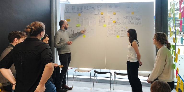
We wanted to implement some innovations on the user experience side to highlight this investment to customers and designers. This would also involve looking at the shop’s user journey, and questioning and adapting it. We therefore created the product matrix, which neatly combines a product-filtering function and a type of map-like product overview. Developing this concept was a lot of fun, and the first user tests were very promising. Even 80% of the development process went without a hitch. But the remaining 20% reminded us how difficult it is to be innovative with a process that users are already familiar with. After all, the way users search for products is intuitive, making innovating in this area difficult. We were trying to re-establish a well-trodden path that users across the world were already used to using, which meant that it would only be tolerated if it was easier to use. They were used to the website as it was, and their behaviour would only change if the new solution was easier, faster and more intuitive. The results of further user tests were quite frustrating, yet also informative. And what did they tell us? First and foremost, to stop what we were doing.
The positive side
We put a stop to further investments. We had to accept that the risk of implementing the solution was too high – we did not want to see any reductions in sales. The new online shop still has many new features, even if it isn’t quite as innovative for the users as initially hoped. But while we could not create a new e-commerce user journey, we were able to focus on sustainability. Of course, we learnt a lot. We used over ten different technologies and went live with a new online shop. This involved investing in expandability, the foundation, a new content strategy and lots of new technologies, just no new e-commerce user journey. It just goes to show that even a great idea and initially positive results from user tests are not always enough to warrant investing in a particular innovation.

