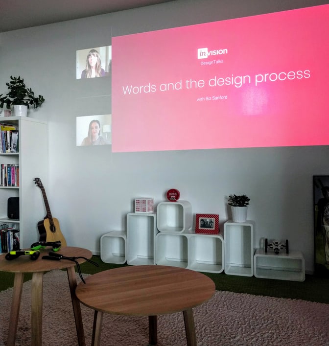
Thanks to Invision, we get a week of free great talks!
Invision proposed four talks about UX copy, about process, inclusive UX copy, how UX writers and designers can better collaborate, and how to improve forms with great copy.
Biz Sanford held the first talk. She manages Shopify’s voice and tone, sets content standards, and teaches her workmates how to write their own content.
Her talk was about consistent interface content. It is a core element of a well-designed user experience. She explained how to incorporate content throughout the design process.
Her main advice was to be specific. Any Lorem ipsum text or scribble should be banished from sketching to wireframing.
My key learnings about Biz inspiring talk
Step 1: Sketching
When sketching, we don’t find the exact words that we will use in the final copy. Our content will go through feedback rounds before it is final. However, we should already chose appropriate words. We should be especially careful with the following components that are key to the functionality:
- headings for pages and sections,
- key verbs and nouns,
- buttons and link text.
Words are essential to the user experience, they lead the user to do what they want. Sketching with words will help you have a better overview of what needs to be designed. It is useful to work with a diverse team to gather different words: don’t stick to you own jargon.
Step 2: Wireframing
Her idea to break down in a table like Googlesheets or Excel all the content elements is most interesting! It makes sure we don’t forget a piece of the scenario. I find it especially useful for multilingual websites. The table provides an overview of the naming of all elements, their translation, and any design needed (like an icon). It can be shared with all team members. It will ensure a consistent naming of the elements in all languages.
Step 3: Content in low fidelity mockups
At this stage, we use realistic content and real data. To show that it is not a finalised version of the content, we can use a funny font (like comic sans). It helps every team member understand how it works without too many explanations. We want to gather robust feedbacks on flow and functionality rather than wording or typo.
My favourite advice she gave was to use the wording of your users. You can talk to the team members who have direct contact with your customers for example. I find that a team often uses specific jargons, maybe legal or technical and often does not realise that their users speak a different language.
Step 4: Content in high fidelity mockups
At Shopify, the project team organises polish reviews. The team sits together and ‘plays’ with the product to check that everything is right.
It is definitely something I would like to start here at Liip! It’s useful to have team members who did not write the copy doing some re-readings. When we are too focused on our work, sometimes mistakes slip our notice and external advice is the key to go back on track.
Questions & Answers with Biz
It was a live talk. Wand we could ask questions and comment. Here is a few themes that came up.
Content is often dealt with at the end of a project. How to be a strong advocate for content?
Designers are content’s best ally. Designers can encourage to use real content and use it early. People will follow. The usefulness of content is self explanatory when it’s already incorporated in the design.
Consistency is essential.
Users don’t care that one team did this and another team did that. Consistency builds credibility and trust. A good option is to create a glossary where all team members can contribute. At the best, the glossary is shared with the marketing team too.
Does the layout fits the content or does the content fits the layout?
Neither! Both of them shape each other, this is why content should be involved as early as possible. Designers and content strategists should collaborate all along the way.
Further readings on content at Shopify and usefool tools
If you missed Biz’s talk and my little summary woke your curiosity up, read her blog post Words and the design process - Greetings from a friendly content strategist. She explains everything with details, sketches and images. The content of this blogpost is very similar to the content of her talk.
The content team at Shopify shares many learnings. Read their blog to learn more on content and design.
For example I recommend Product content at each stage of a project - How content strategists help teams build better products. The blogpost helps you pinpoint where and when you can add-value in a project.
Julien, who participated to the meet-up wrote a great blog post (in French) to share his personal learnings La place de la Copy dans le processus de création.
Useful tools to test the readability
To test the readability of our English content, we can use the Hemingway App.
To test the readability of our German content, we can use the website Psychometrica.
Do you have such a tool for French?

Watching the talk together and sharing learnings
Since it was a remote talk, we created a cosy atmosphere at Liip to have a chance to discuss and share our learnings. I very much enjoyed our evening! Thanks to all participants and my team mates who make fun and projects possible everyday !

