What's it about?
Setting up a new web design project from scratch is very time and money-consuming. A team of UX/UI designers and frontend developers have created the «Liip Design Library Template» to speed up this workflow. It not only saves time, but also enables better collaboration between design and development.
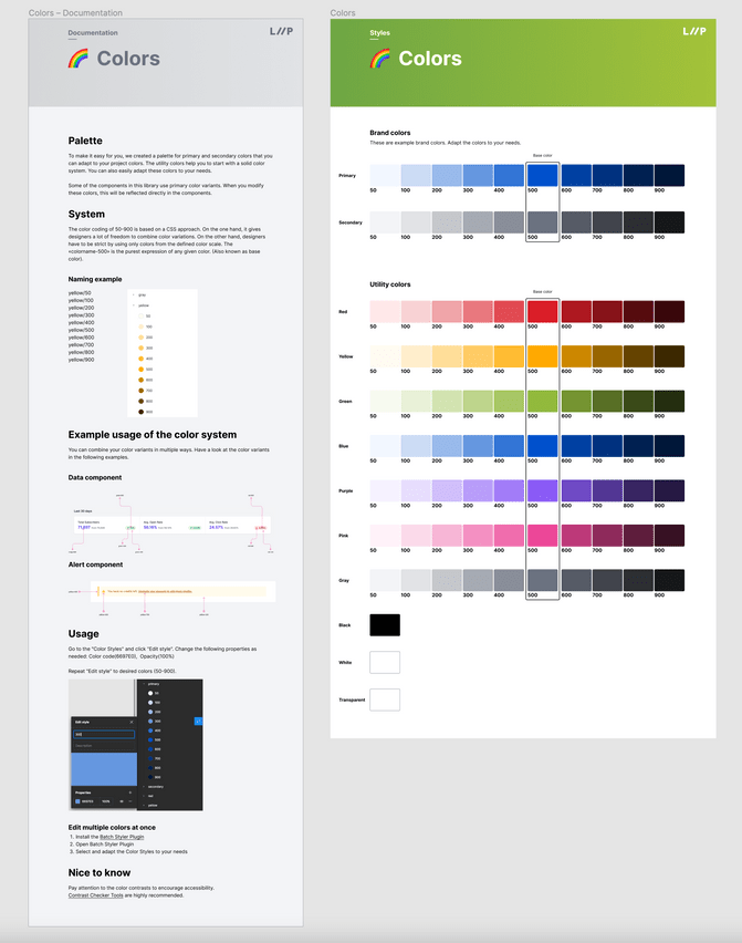
The Liip Design Library Template is not a final full-blown design library or design system. It is a Figma file with all the necessary basic elements to start a design project. We provide a structure where components can be inserted and help to build rock-solid components with the latest Figma features. It is structured in a way that it can be adapted very quickly. We have already used it for small web projects. This template allows a high design quality and helps to build the bridge between design and frontend development. Good UX Writing practices and how to use Figma give designers more competencies in their daily business. By implementing the starter Library, designers can switch between projects more easily because of the same file structure.
Get the file now: Figma Community file
Do you have questions? Mark your calendars and join our webinar on Thursday, October 20, at 17:00 - 18:00 CEST. Sign up now.
What problems did we have to solve?
Many design tools emerged and competed for our attention a few years ago. In the meantime, a few of those tools are established on the market. Figma was able to grow a lot especially in the enterprise field. Since the software is web-based, larger teams can seamlessly work together simultaneously. This way of working requires new structures. To avoid misunderstandings, duplication and pure chaos, we had to build a common structure in Figma that worked well for everyone. Having a starter kit in Figma helps to manage the core styles, such as font declarations or colour scales, for example Designers don't have to do all this visual groundwork from scratch each time again. In addition, a simple adaptation of the styles requires little effort and is usually sufficient.
Another problem we had to solve was to bridge the gap between design and development. Because designers use different terms than developers, communication was problematic. So we defined a common language that is widely used in our projects: the utility-first CSS framework Tailwind. The consistent terminology makes it very easy for a frontend developer to understand and implement the design. It also gives Designers a consistent foundation to build new components and patterns.

What do we gain by open sourcing the file?
One of our principles at Liip is "open over closed", and we strongly believe in collective intelligence. We are convinced that even better solutions can be created by sharing this knowledge with our community. That's why we decided to open source the Liip Design Library Template that everyone can use. We believe in benefiting from feedback from other designers and look forward to new ideas on how we can improve the Liip Design Library Template.
Who is the template for?
Everyone working with Figma can duplicate the template and use it for free. It can be used to expand your Figma skills and build up projects in a proven structure. Of course, it’s also possible to only use parts of it or develop it even further. For less experienced designers, it can be used as a checklist or source of inspiration. In addition, we have written documentation on each topic that provides tips and tricks for a designer's everyday life. Our UX writing experts have also included some tips for applying good UX writing practices.
How can I get the file?
Visit the Figma Community page
- Duplicate the file to your Figma account and start your journey
- External File contributions are welcome
- Happy or not? Please comment below or send us direct feedback to toolkit@liip.ch.
Do you have questions?
Mark your calendars and join our webinar on Thursday, October 20, at 17:00 - 18:00 CEST. Sign up now.

