Welcome to part two of three in our mini blog post series on how to build a recipe assistant with automatic speech recognition and text to speech to deliver a hands free cooking experience. In the last blog post we provided you with an exhaustive hands on text to speech (TTS) market review, now its time to put the user in the center.
Workshop: Designing a user experience without a screen
Although the screen used to dominate the digital world, thanks to the rapid improvement of technologies, there are more options emerging. Most of mobile users have used or heard Siri from Apple iOS and Amazon Echo and almost 60 Mio Americans apparently already own a smart speaker. Until recently sill unheard of, nowadays smart voice based assistants are changing our life quickly. This means that user experience has to think beyond screen based interfaces. Actually it has always defined a holistic experience in a context where the user is involved, and also in speech recognition and speech as main input source, UX is needed to prevent potential usability issues in its interaction.
Yuri participated in our innoday workshop as an UX designer, where her goal was to help the team to define a recipe assistant with ASR and TTS, that help the user to cook recipes in the kitchen without using his hands, and is a enjoyable to use. In this blog post Yuri helped me to write down our UX workshop steps.
Ideation
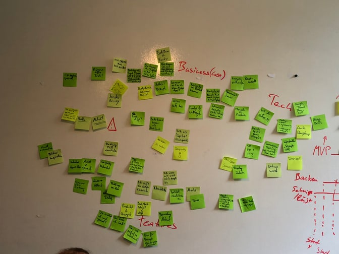
We started off with a brainstorming of our long term vision and short term vision and then wrote down down our ideas and thoughts on post its. We then grouped the ideas into three organically emerging topics, which were Business, Technology and User needs. I took the liberty to highlight some of the aspects that came to our minds:
- User
- Privacy: Users might not want to have their voice samples saved on some google server. Click here to listen to all your samples, if you have an Android phone.
- Alexa vs. Mobile or is audio only enough?: We spent a lot of discussion thinking if a cookbook could work in an audio only mode. We were aware that there is for example an Alexa Skill from Chefkoch, but somehow the low rating made us suspicious if the user might need some minimal visual orientation. An app might be able to show you the ingredients or some visual clues on what to do in a certain step and who doesn't like these delicious pictures in recipes that lure you in to give a recipe a try?
- Conversational Flow: An interesting aspect, that is easy to overlook was how to design the conversational flow in order to allow the user enough flexibility when going through each step of recipe but also not being to rigid.
- Wakeup Word: The so called wakeup word is a crucial part of every ASR system, which triggers the start of the recording. I've written about it in a recent blog post.
- Assistant Mode: Working with audio also gives interesting opportunities for features that are rather unusual on normal apps. We thought of a spoken audio alert, when the app notifies you to take the food from the oven. Something that might feel very helpful, or very annoying, depending on how it is solved.
- Technology
- Structured Data: Interestingly we soon realized that breaking down a cooking process means that we need to structure our data better than a simple text. An example is simply multiplying the ingredients by the amount of people. An interesting project in this area is the open recipe format that simply defines a YAML to hold all the necessary data in a structured way.
- Lag and Usability: Combining TTS with ASR poses an interesting opportunity to combine different solutions in one product, but also poses the problem of time lags when two different cloud based systems have to work together.
- Business
- Tech and Cooking: Maybe a silly idea, but we definitely thought that as men it would feel much cooler to use a tech gadget to cook the meal, instead of a boring cookbook.

User journey
From there we took on the question: “How might we design an assistant that allows for cooking without looking at recipe on the screen several times, since the users’ hands and eyes are busy with cooking.”
We sketched the user journey as a full spectrum of activities that go beyond just cooking, and can be described as:
- Awareness of the recipes and its interface on App or Web
- Shopping ingredients according to selected recipe
- Cooking
- Eating
- After eating

Due to the limited time of an inno-day, we decided to focus on the cooking phase only, while acknowledging that the this phase is definitely part of a much bigger user journey, where some parts, such as exploration, might be hard to tackle with an audio-only assistant. We tried though to explore the cooking step of the journey and broke it down into its own sub-steps. For example:
- Cooking
- Preparation
- Select intended Recipe to cook
- Select number of portions to cook
- Check ingredients if the user has them all ready
- Progress
- Prepare ingredients
- The actual cooking (boiling, baking, etc)
- Seasoning and garnishing
- Setting on a table
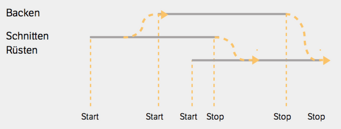
This meant for our cooking assistant that he needs to inform the user when to start each new sub-step and introduce the next steps in a easy unobtrusive way. He has also to track the multiple starts and stops from small actions during cooking, to for example remind the user to preheat the baking oven at an early point in time, when the user might not think of that future step yet (see below)

User experience with a screen vs. no screen
Although we were first keen on building an audio only interface, we found that a quick visual overview helps to make the process faster and easier. For example, an overview of ingredients can be viewed at a glance on the mobile screen without listening every single ingredient from the app. As a result we decided that a combination of a minimal screen output and voice output will ease out potential usability problems.
Since the user needs to navigate with his voice easy input options like “back”, “stop”, “forward”, “repeat” we decided to also show the step that the user is currently in the screen. This feedback helps the user to solve small errors or just orient himself more easily.
During the ux-prototyping phase, we also realised that we should visually highlight the moments when the user is expected to speak and when he is expected to listen. That's why immediately after a question from the app, we would like to show an icon with a microphone meaning “Please tell me your answer!”. In a similar way we also want to show an audio icon when we want the user to listen carefully. Finally since we didn’t want the assistant to permanently listen to audio, but listen to a so called “wake-up-word”, we show a little ear-icon, signalling that the assistant is now listening for this wake-up-word.
While those micro interactions and visual cues, helped us to streamline the user experience, we still think that these are definitely areas that are central to a user experience and should be improved in a next iteration.
Conclusion and what's next
I enjoyed that instead of starting to write code right away, we first sat together and started to sketch out the concept, by writing sticky notes, with ideas and comments that came to our mind. I enjoyed having a mixed group where we had UX people, Developers, Data Scientists and Project owners sitting at one table. Although our ambitious goal for the day was to deliver a prototype that was able to read recipes to the user we ran out of time and I couldn’t code the prototype on that day, but in exchange I think we gathered very valuable insights on a user experiences that work and that don’t work without a screen. We realized that going totally without a screen is much harder than it seems. It is crucial for the user experience that the user has enough orientation to know where he is in the process in order for him not to feel lost or confused.
In the final and third blog post of this mini series I will finally provide you with the details on how to write a simple flask and socket.io based prototype that combines automatic speech recognition, text to speech and wake-up-word detection to create a hands-free cooking experience.

