In this article, I share a personal selection of takeaways. For further inspiration, I recommend you to read the UX Copenhague 2019 full programme.
*Thank you UX Copenhague for the pictures. Sheryl Cababa on the cover picture.
At Liip, we advise companies. We help building and developing their product and service.
Every Liiper benefits from an education budget so we keep learning to deliver state-of-the-art solutions. (Thank you Liip for this learning opportunity).
I recently started questioning the place of ethics in my work as a UX writer. I am convinced that us, people creating digital tools, we have a responsibility in the projects we build. We can have a role in advising about ethical decisions in a product and service. I was appealed by the theme of UX Copenhague 2019. I expected to listen to experiences, discover tools and methodologies.
In two days of conference at UX Copenhague, I heard so many ideas and insights. I was like a sponge that absorbs as much as possible. Today, I feel that I am still processing information and finding ways to apply my learnings in my work.
Many thanks to the organisation team and all the speakers <3
“Internet, go the f%& ck to sleep!” with Jim Forrest
In this talk, Jim questioned the constant availability and consumption that internet offers. He discussed the waiting caused by the uploading of the early internet, the retention metrics of platforms and notification micromanagement.
Jim recalled with humor and enthusiasm his experience of immigrating in Denmark from the US.
He was surprised by the opening hours of the shops and the system of home delivery. ‘To my standards, shops are never open in Denmark and it is not home delivery if I have to pick up my purchase at a post office’.
Danemark, shops close in the evening and home delivery is not dropped at your doorstep if you are not home when your purchased is delivered. His experience of consumption in the US was different. He could nearly buy anything at anytime.
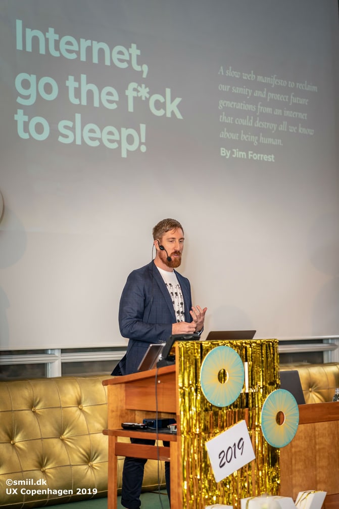
Jim questioned the fact that now there is no ‘time-off’ such as our earlier waiting or the closing hours of shops. Today we can constantly be available and never completely off. People need to learn how to micro manage notifications and time-off keyboard.
What about people who are not savvy enough to micromanage? Who is responsible for them?
Jim proposes directions for solution:
- is the government supposed to protect the people?
- are private companies supposed to protect the people ?
- what about a star rating of societal goods which controls how much traffic we are allowed to?
"The Dark Side of Information Behavior” with Nicole A. Cooke
Nicole A. Cooke is a PhD in communication, information, and library studies. She led us through her latest findings on how people are emotionally involved when reading information.
The emotional involvement of people determine how they will interact with a product/service.
‘People are being led by their gut, even if the information they read is unreasonable.’ says Nicole
When an info is online, before we use it, they are two steps:
- affective treatment of information,
- cognitive treatment of information.
The part of our brain managing emotions overrides the part of our brain managing cognitive thinking. When people filter information based on emotions, they use cognitive biases.
When a negative emotion is triggered, the best content ever is useless. If something triggers a negative emotion, the user is gone. A negative emotion is triggered in an instant.
A negative emotion can be triggered by:
- color,
- music,
- the type of information shared,
- the level of trust between the brand or the speaker and the user,
- the interface (how easy or complicated it is to use).
If the emotion is negative during the affective treatment of information, the information never reaches the step of the cognitive treatment of information.
The trust we attribute to the speaker or brand influence our affective reaction to the information. When we trust, we don’t cognitively evaluate.
Trust is received and can be lost in an instant. A brand should build trust with its users. A brand should care for its users and be as transparent as possible. Lack of transparency means risk of losing trust.
Nicole discussed the subject of fake news and how news propagates on social media.
There are two types of fake news:
- misinformation: it is an alternative truth, I don’t intend to trick you,
- disinformation: I intend to say something wrong to trick you.
The intent of the person saying or publishing the news makes the difference between misinformation and disinformation.
"Privacy and Consent-related Content in Your Product: At the Right Time, In the Right Place, the Right Way" with Saskia Videler
During this workshop, Saskia Videler shared one of her writing processes. Her process focused on interface content related to privacy and consent issues. The title of the workshop states the objective of her writing process: Privacy and Consent-related Content in Your Product: At the Right Time, In the Right Place, the Right Way.
In small groups, we practiced her process. It includes four steps:
- Right content, right time: Saskia discussed themes such as: definition of the business’s goals, the user’s goals, the customer journey and the prerequisite of the content,
- Definition of the tone: Saskia discussed themes such as: definition of level of stress of the situation for the user, what could make the situation less stressful, the emotions and feelings of the user, our tone, how we can positively impact their stress?
- Craft the content: in small groups, we drawn quick wireframes including the content obviously.
- Test the content: in small groups we identified how the content could be tested.
“Designing for Unintended Consequences” with Sheryl Cababa
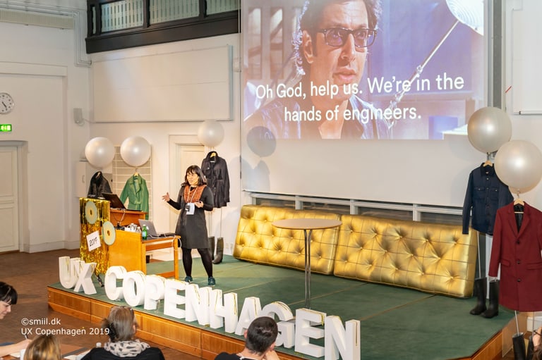
Design is not neutral. Sheryl Cababa explained her idea of unintended consequences with the movie Jurassic Park.
At the beginning of Jurassic Park, the people are enthusiastic about hatching dinosaur eggs. They are in awe watching adult dinosaurs. Later in the movie, dinosaurs turn against humain. Suddenly, the scientific possibility of dinosaurs rebirth does not seem great.

"Navigating Our Evolving UX Landscape: Why and How to Create Your Personal Code of Ethics" with Quinn Keast
I was impressed by Quinn’s talk. I currently question the place of ethics in my work and I wonder how to create and apply ethical guidelines.
Quinn is one step further already. He decided that it was essential to have a personal code of ethics. He does not only rely on external factors (like a law) to guide his work. Laws keep up with development. Laws are ‘late’, in the sense that they are often created as a reaction to a technology.
Quinn built his personal code of conduct. He openly shares his code of conduct to help you understand me better and help us work together.
Read Quinn’s code of conduct.
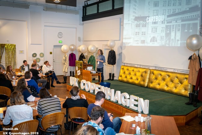
Your personal code of ethics is useful to :
- help us take decisions.
- draw our lines: what are you okay to create? what is beyond your limits? Draw your line instead of reacting.
Quinn recommends that your personal ethics grow with you. Our personal code of ethics is a living document that changes over time.
“GDPR Considerations for Designers” with Kathleen Asjes and Mikaela Saletti
Kathleen and Mikaela shared their experience in carrying out GDPR-related research for the online newspaper called Aftonbladet. Aftonbladet is the largest online newspaper in Sweden.
Like many media company, Aftonbladet’s business revenue relies heavily on advertisements. How could Aftonbladet be compliant with the GDPR, empower their users and not lose the business revenue?
Kathleen and Mikaela showed us the different steps of their work to make Aftonbladet GDPR-compliant. Their solution empowers the user:
- the settings icon is available on top of every add. The user can change any time their privacy settings,
- the solution is granular rather than a yes/no question, the user can chose the level of privacy they want.
”Radical Change, Human Scale” with Sara Wachter-Boettcher
« I wanted everyone to feel the pain of a tech that is not made for them »
I found this quote powerful. A tech that is not inclusive is hurtful. A tech is not inclusive in small ways.
For example: not knowing where your datas go or who will access them. Ticking a box ‘mr’ ‘mrs’ ‘ms’ when you feel you are neither, reading information that are way too complicated for your level of language.
Lessons learnt
The key take-aways I brought back from the conference:
- I heard a lot about responsibility: the responsibility of the people building a product, responsibility of the investor investing in a product.
- There is a generation of 40 something men like Jim who contributed to build what is today’s internet, during their twenties and thirties and who experience today after-thoughts. Suddenly what they built is not that great and they start realizing it backfires.
- As a community we are responsible for the information we share. Each of us is responsible for the information that we trust or distrust. When we read an information, we should check if it is true.
- Cookie bars can be improved. It is not a choice to have a single ‘I agree’ button. It is better to propose a granular solution for the users.
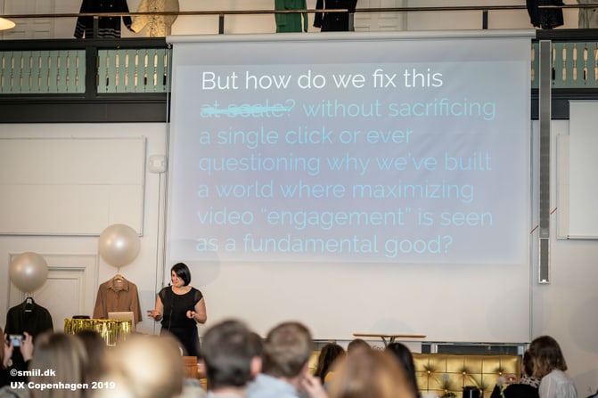
- Let’s build solutions that work for a precise issue. Let’s not discuss if the solution will work at scale. Apply the solution, work with it. Applying rather than discussing.
I came back from Copenhague pumped with all these ideas, with renewed energy for my work.
The effect after the conference is astounding. I still process information today. I am slowly aware of new directions and further readings. I learnt so much.
My next steps after the conference are:
- build tools that bring high ethical values in the product I help creating,
- make my ethical values known: create a plan on how to deal with unethical requests in my work.
Thank you Liip for the opportunity to go to UX Copenhague, thank you to the organisation team for such an interesting event and thank you to all the speakers for coming to talk to us.
Watch the video UX Copenhague 2019
Recommended further readings
Read Thoughts on consent & ethics in tracking user behavior for UX research.
Read Word Choices and Language in UX, Part One: Introduction & the Meaty Bits

